Mobile SEO: A beginner's guide
What is Mobile SEO? Why is it Important?
Search Engine Optimisation (SEO) is all about improving the position of your website on Search Engine Results Pages (SERPs). This includes search engines such as Google and Bing. SEO is achieved by making your website more attractive to search engine algorithms.
Mobile SEO focuses specifically on the application of best practices to make your website work better on mobile devices.
This is done to improve its appeal to search engines that consider mobile an important viewing platform.
Google has made it very clear that they now see mobile devices as the most important platform for website viewing. Since July 2019, Google has used mobile-first indexing.
This means that they place more weight on mobile content when deciding how well a website will rank.
This shift has encouraged developers and designers to change to a mobile-first approach to creating websites. Websites used to be built for desktop viewing first.
Then they would be edited to work ‘as well as possible’ on mobile devices. Mobile-first design flips this on its head. Ensuring that websites are fully functional and easy to navigate on any device.
How to Optimise Your Website for Mobile?
Not just to boost your position on SERPs, but also to ensure that a huge percentage of potential website visitors receive a great experience.
But how do you actually optimise your website for mobile? We explore the various elements to consider below.
Page Speed
One important difference between mobile devices and desktops is how they connect to the internet.
Although most mobile devices can connect to wifi, they are also often used when connected to mobile internet.
As mobile internet can vary widely in speed, it can impact how quickly your website loads.
Statistics suggest that for every additional second your website takes to load, conversion rates drop by an average of 4.42%.
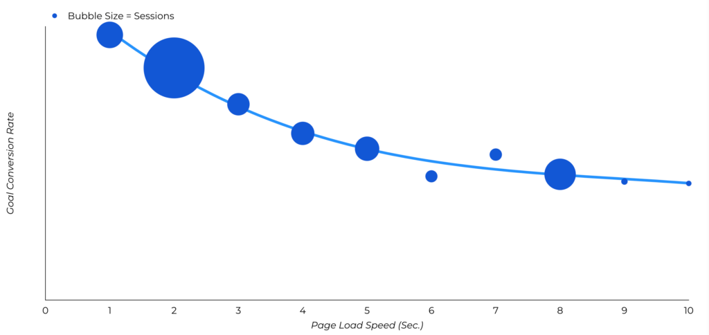
So, speed kills. Or at least a lack of speed kills your success.
You should also consider intent when thinking about mobile page speed.
A desktop user may be sat down, doing deeper research into an interest or topic.
On the other hand, a mobile user is more likely to be looking for a quick answer to a query - making mobile page speed even more important.
- Optimise page images:
- Convert to WebP or PNG format
- Resize images
- Compress images
- Consider browser caching
- Minimize the amount of time you want website information to be cached
- Minimize redirects
- Every redirect adds time to loading, so remove redirects where possible
Minify Js, CSS and Images
Minifying is the process of removing unnecessary characters within your source code.
These could include characters such as spaces, comments, line breaks, commas, and block delimiters.
Typically these characters are used to make it easier for humans to read the code, which can be beneficial for future editing.
But these unnecessary characters are not at all useful to mobile browsers.
So, when you minify the code, you make it easier and quicker for these browsers to read your code. This makes it quicker for your website to load.
- Open your Js, CSS, and image code
- Remove unnecessary code such as:
- Spaces
- Comments
- Line breaks
- Commas
- Block delimiters
- Review your code to ensure it still works
In the past, some mobile website browsers weren’t able to support elements such as Js, CSS, and image code. This meant that website owners had to block some or all these elements for their site to work on mobile.
Luckily, advancements in mobile devices mean that this is no longer true in most cases.
Search engines now use advanced tools such as the Smartphone GoogleBot. This tool finds and categorizes content based on the best user experience. This includes Js, CSS, and images.
In fact, search engines now use these elements to decipher whether your website is truly mobile-responsive.
So - don’t block them.
Disable Popups on Mobile
Website popups need to be carefully considered, as they can have a negative impact on user experience.
They break the expected flow of a user's journey through a website and can often be spam-like and unwelcome.
They can be difficult and frustrating to try and close. In some cases, where mobile responsiveness has not been at all considered - pop-ups on mobile devices can actually be impossible to close.
Popups on mobile sites are likely to lead to high bounce rates. If you use them on the desktop version of your website, it is worthwhile blocking them on your mobile site.
Improve Your Mobile UX
Mobile UX is all about the experience that your website visitors have when they visit your mobile site.
Google makes it clear that they want to serve searchers with websites that offer the best experience. So, it is no surprise that mobile UX will impact your SERP rankings.
When someone visits your mobile site it should be easy for them to find what they are looking for. This means having a clean design and clear links to relevant content.
- Login to Google Search Console
- Navigate to the ‘Experience’ section
- Click the ‘Mobile Usability’ tab
- Review the data
The data you find here will tell you which of your pages are or aren’t optimised for use on mobile devices.
When issues occur, it will also indicate what may be causing them, making them easier to remedy.
- Use a clear menu and search bar
- Only use short forms
- Minimize content as much as possible
- Don’t use pop-ups
- Continually test your mobile site
- Use big touch targets
- Serve smaller images
Use HTML5
Do you remember this?
You conduct a search on Google. You select the site that appears to best match your search. The website loads and…BAM…you are told you have to download a piece of software (usually Adobe Flash) to view the content.
It didn’t make for the best user experience.
HTML is a markup language that is widely used for structuring and presenting content online.
Many websites online today use a version of this language called HTML4. This was an improvement on earlier versions of HTML. Yet it still required plug-ins like Adobe Flash to display some content such as animations and videos.
HTML5 is the latest version of HTML. It allows websites to use all types of content without the need to download software.
Websites that use HTML5 can create seamless visitor journeys. They do this by using a combination of content types to communicate information and compel action.
I know we risk sounding like a broken record here. But the point is important to make:
Creating a better user experience (using HTML5) = better rankings on SERPs
Google themselves stipulates, in their guidance surrounding the creation of mobile websites:
“Use HTML5 standards for animations to provide a good experience to all your users”.
Use Schema or Structured Data
Search engines typically use schema or structured data in order to gain a better understanding of what your webpage is all about.
By providing search engines with easy-to-read schema and structured data it makes it easier for them to know what to rank your mobile website for.
Website schemas can be described as words or tags that are used in the website code to indicate the content that is included on that page.
Schema is a “shared vocabulary” that was created in collaboration between all the major search engines (Google, Bing, Yandex, and Yahoo!). It makes it easy for websites to easily and clearly communicate with them.
For example, the schema for this guide could include key information such as the title of the guide and a description of what is included. It may look like this:
"@context": "https://schema.org/",
"@type": "HowTo",
"name": "Mobile SEO: A Beginners Guide",
"description": "How to optimise your website for mobile SEO"
When you use the correct schema you can become eligible for special search result features and enhancements. This includes Events, FAQs, How-Tos, Carousels, and Articles.
So, how do you create the schema for your website?
- Visit Google’s Structured Data Markup Helper
- Select the type of content you are creating from the list
- Input the URL you want to markup (or input the HTML)
- You will be directed to a page that displays your webpage and data items
- Select the elements you want to markup
- Hit ‘CREATE HTML’
- Add the markup to your website
Use Mobile-Friendly Toolkit (Mobile Design Best Practices)
Our final tip for ensuring that your website is mobile-friendly is to use a simple tool provided by Google. This tool will tell you if your site is usable on a mobile device.
The best thing about this tool is the fact that it tells you whether Google considers your site mobile-friendly.
In contrast to other approaches, this is a very powerful method to ensure you are well set up for mobile SEO.
- Visit Google’s Mobile Friendly Test
- Input the URL of the webpage you want to test
- Hit ‘TEST URL’
- Inspect your results
Mobile SEO: Summary
It is clear that taking a mobile-first approach is crucial to website success.
More than half of search engine traffic comes from mobile devices.
So, failing to optimise your site creates poor experiences and negatively impacts your SERP rankings.
Use the tips we have highlighted in this guide to help you drastically improve your mobile website SEO.

Written by
Ajay C
Founder & CEO at Mojo Dojo with over 15 years of experience in digital marketing, cybersecurity, and engineering.