

Google Ads Ad Strength 'Excellent' converted at 1.3% vs 3.8% for 'Good' across $75k
Every responsive search ad in Google Ads carries a label: Poor, Average, Good, or Excellent. It sits in the ads table, it shows up in recommendations, and it's the first thing a new account manager is told to fix. "Get all your ads to Good or Excellent" is close to universal advice.
We pulled ten days of performance for every enabled ad in a mid-sized search account (roughly $75,000 of spend), and grouped it by that label. Here is what came back.
Ad Strength | Spend | Impressions | Clicks | Conversions | CTR | CVR | Cost per lead |
|---|---|---|---|---|---|---|---|
Excellent | $9,548 | 12,385 | 890 | 11.2 | 7.19% | 1.3% | $850 |
Good | $6,787 | 8,331 | 481 | 18.5 | 5.77% | 3.8% | $367 |
Average | $42,111 | 67,237 | 3,767 | 114.0 | 5.60% | 3.0% | $369 |
Poor | $16,759 | 12,666 | 1,196 | 35.0 | 9.44% | 2.9% | $479 |
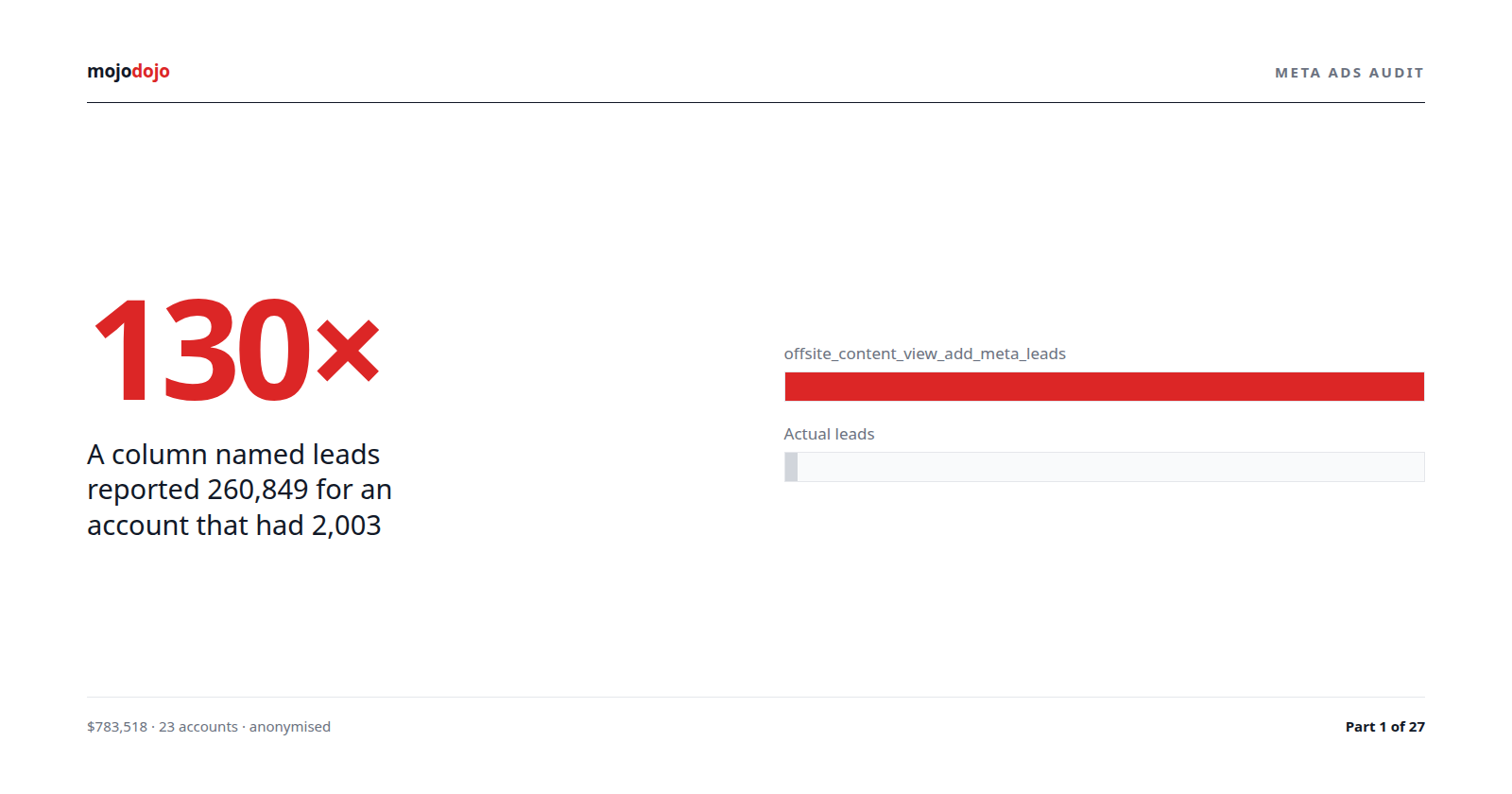
Ads rated Excellent converted at a third the rate of ads rated Good, and cost 2.3× more per lead. Ads rated Poor had the highest click-through rate in the account, which is the one thing Ad Strength is most often assumed to predict.
If the label meant what people think it means, that table would be upside down.
What Ad Strength actually measures
Google's documentation is reasonably candid about this, but the candour rarely survives into agency playbooks. Ad Strength scores four things:
Factor | What it's checking | What it rewards |
|---|---|---|
Headline count | How many of the 15 headline slots are filled | More headlines |
Description count | How many of the 4 description slots are filled | More descriptions |
Keyword inclusion | Whether the ad group's keywords appear in the copy | Keyword insertion or literal repetition |
Asset uniqueness | How different the headlines and descriptions are from each other | Variety |
Note what is not on that list: click-through rate, conversion rate, cost per conversion, quality score, landing page match, anything downstream of the impression. Ad Strength is calculated before the ad has served a single impression. It cannot be a performance metric because there is no performance in it.
It is a score for how much raw material you have handed the combination engine. That's all. Google's own help centre says it "is not a factor in Ad Rank" and has no direct bearing on auction outcomes.
Why more material can convert worse
Here is the mechanism, and it's not mysterious.
A responsive search ad with 15 unique headlines and 4 descriptions can be assembled into thousands of combinations. Google picks the combination per auction. The more diverse your assets (the more Ad Strength rewards you), the more combinations exist that no human ever wrote or reviewed.
Ad design | Headlines | Combinations possible | Message consistency |
|---|---|---|---|
Tight, 3 pinned headlines | 3 | 1 | Every impression says the same thing |
Moderate, 6–8 headlines, some pinned | 8 | dozens | Mostly on-message |
"Excellent", 15 diverse headlines, nothing pinned | 15 | thousands | Whichever three the algorithm chose |
The tight ad says one thing, and the landing page says the same thing, and the searcher who clicked knows what they're going to get. The Excellent ad says one of several thousand things, and some of those combinations promise something the landing page doesn't deliver, and the searcher who clicked on "Free Quote Today" and lands on a rebate explainer bounces.
This is the ad-to-landing-page consistency argument, and it is a well-established driver of conversion rate. Ad Strength rewards the thing that works against it.
There's a second mechanism, visible in the CTR column. Poor-rated ads (fewer, more specific headlines), had the best click-through rate. That's consistent with specificity winning the click: "6.6kW Solar From $X" beats a rotating selection of generic benefit statements for someone who searched for a 6.6kW system. Diversity is Ad Strength's proxy for relevance. It is not the same thing.
The honest caveat
This is correlational, and the correlation is confounded in at least three ways.
Confound | Why it matters |
|---|---|
Ad Strength is not randomly assigned | High-strength ads tend to be in ad groups someone recently worked on, which may differ in keyword mix, bids, and landing page |
Volume is uneven | Excellent has 890 clicks and 11 conversions; Average has 3,767 and 114. The Excellent bucket has wide confidence intervals |
Campaign mix | If Excellent ads cluster in a campaign that converts badly for unrelated reasons, the label takes the blame |
So the finding is not "Excellent ads convert worse." The finding is "in this account, across $75,000, the label did not predict conversion rate in the direction everyone assumes, and the ads it rated worst had the best CTR." That is enough to stop treating the label as a KPI. It is not enough to conclude the label is inversely predictive everywhere.
The rigorous version is an experiment. Google Ads has one built in: an ad variation, run inside a single ad group, comparing an Excellent-rated ad against an Average-rated one with otherwise identical targeting. That removes every confound in the table above at once. We have the harness in place and will report the result.
What would change our mind
Evidence | Would suggest |
|---|---|
Ad variation test shows Excellent variant converting better | The label has predictive value once confounds are removed |
Excellent ads' CVR rises as their volume grows | The 1.3% is small-sample noise |
Pinned-headline Excellent ads outperform unpinned ones | It's the unpinned diversity, not the label, that hurts |
Same pattern repeats across three or more accounts | It's structural, not account-specific |
Until one of those lands, the burden of proof belongs on the score, not on the sceptic.
Where this leaves the "get everything to Excellent" advice
It's advice about inputs masquerading as advice about outcomes. Filling all 15 headline slots is easy to do, easy to verify, and easy to report to a client as progress. None of those properties make it correlated with cost per lead.
What the advice optimises | What the client wants |
|---|---|
Number of assets | Number of leads |
Asset diversity | Message clarity |
A green label in the interface | A lower number on the invoice |
The two columns overlap sometimes. They are not the same, and in this account they pointed in opposite directions.
What we recommend instead
Measure the label against your own outcomes before you optimise toward it. Ads report → add the Ad Strength column → add Conversion rate and Cost per conversion → sort. Two minutes. If your Excellent ads aren't outperforming, you have your answer for this account, and no general claim about Ad Strength overrides it.
Pin what matters. A pinned headline in position 1 guarantees every impression leads with your core message. Ad Strength penalises pinning. Ignore that.
Write fewer, sharper headlines. Eight good headlines with two pinned will usually beat fifteen diverse ones. The label will drop to Average or Good. That is fine.
Run the test. One ad group, two ads, one variable. If Excellent wins, use it. If it doesn't, you've learned something about your own account that no help-centre article can tell you.
Never put Ad Strength on a client report as a KPI. It is a checklist item at most. Reporting it as a performance metric teaches the client to value something that, on the evidence, doesn't predict what they're paying for.
A related finding: identical ads, different CTR
While this account was running a landing page test, it produced a data point that bears directly on what Ad Strength can and can't predict.
The test used ad variations: the same responsive search ads, byte-for-byte identical headlines and descriptions, with only the final URL changed. On the first full day both arms served:
Test | Control CTR | Variant CTR | Gap |
|---|---|---|---|
Battery (6 campaigns) | 3.16% | 6.35% | +101% |
Panel (1 campaign) | 3.60% | 5.53% | +54% |
Same copy. Same Ad Strength label, necessarily. A 54–101% difference in click-through rate, because the variant ads were new, and Google's rotation gives new creative an exploration boost while it estimates their expected CTR. The gap decayed over the following days as real data replaced the estimate.
The point for Ad Strength: CTR is driven substantially by serving decisions, not just by the copy. Two ads with identical text and identical Ad Strength scores produced wildly different CTRs because of when they were created. A label computed from the text alone can't see any of that, which is one more reason it doesn't predict the outcome.
What a test-ready ad group looks like
The account's highest-volume battery campaign had three enabled ad groups. Each carried exactly one responsive search ad.
Ad group | Enabled RSAs | Ad Strength |
|---|---|---|
Home Battery | 1 | Average |
Solar Battery | 1 | Average |
Solar & Battery Package | 1 | Poor |
One ad per ad group means there is nothing for the rotation to choose between and nothing to compare. It's also below Google's recommended minimum of two RSAs per ad group. But the fix is not "get them to Excellent": it's a second ad in each group, written to test one specific hypothesis against the first, so that in a month there's a result rather than a label.
The wider point
Google Ads surfaces a growing number of scores: Ad Strength, Optimization Score, Quality Score, the various "recommendation" percentages. Some of them are genuinely useful. Some are inputs dressed as outcomes. The way to tell the difference is the same every time: pull the score alongside your conversion data and see if it predicts anything.
For Ad Strength, in this account, it didn't. Check yours.